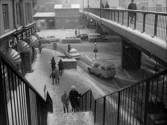
Click here to learn the story.
|
Click here to learn the story. |
|
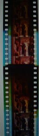
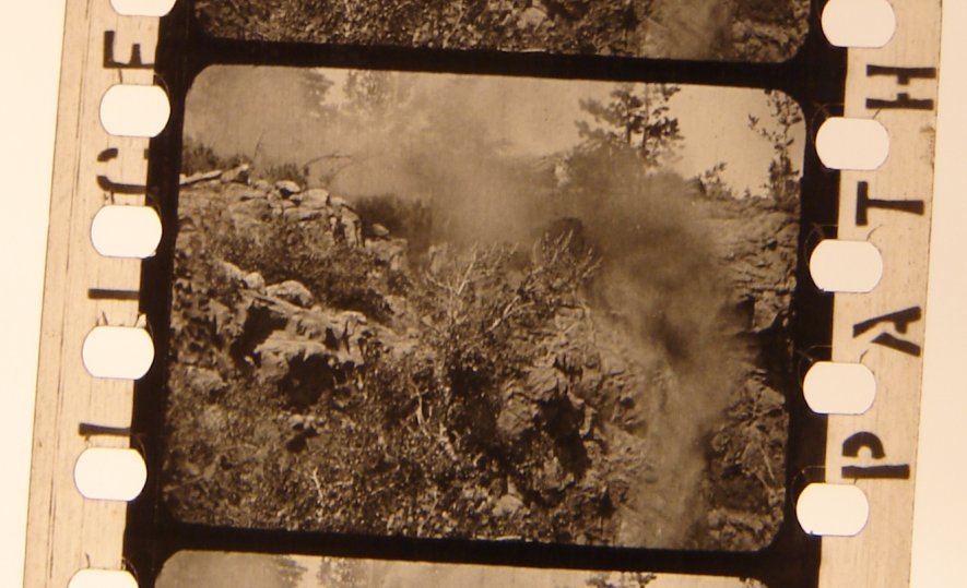
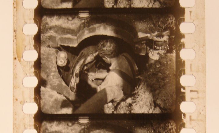
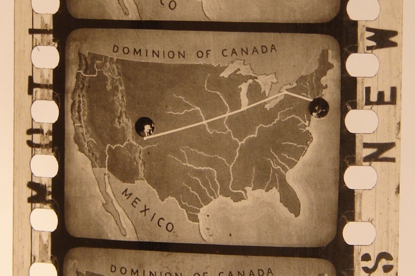
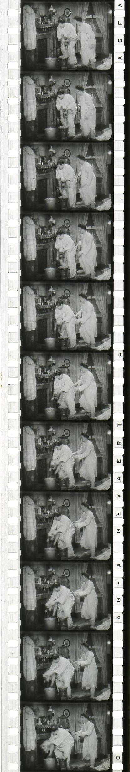
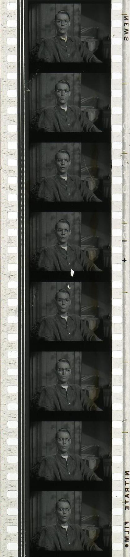
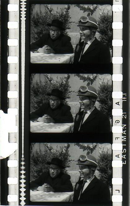
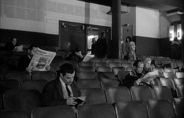
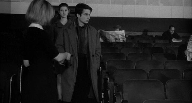
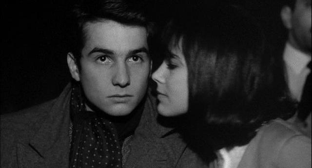
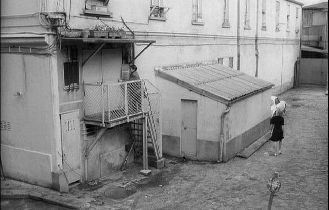
Above is a two-frame snippet of an unidentified silent film, two frames that exhibit rather severe degradation.
Films, like tapes, like videotapes, like CDs, like laserdiscs, like DVDs, are not at all a permanent medium.
Film rots, quite quickly.
This silent film, like most silent films, was issued on a nitro-cellulose base,
which has its own peculiar characteristics as it gets old and groggy.
The base degrades and eats into the emulsion.
Eventually the emulsion falls off, and the base turns into sticky goo, and finally dust.
And the older it gets, and the more it degrades, the more inflammable it gets.
And not just a little bit inflammable.
The fires are ferocious.
Though you can localize them to minimize damage,
you cannot extinguish them.
In a warehouse stockpiled with nitrate films, the tiniest spark can ignite all the films and cause a massive explosion.
That’s why film vaults that house nitrate stock have explosion vents.
(So, what should you do when you find a nitrate film?
Should you dump it into a barrel of water?
Should you toss it into the sea?
Should you stuff it under your neighbor’s house and light a match?
Should you think you’ve found a treasure for which collectors would pay thousands or millions of dollars?
No. Never.
You should respect it.
You should leave it alone.
You should IMMEDIATELY call a film archive for advice.)
Click on the frame to see the whole slide show for a great education!
Despite all that, the reason I include this snippet, which I was delighted to find on the CBS News web site,
is that it demonstrates what a full-frame silent aperture looks like.
It has an “aspect ratio” (ratio of width to height) of about 1.33:1.
The image on the film will vary from one camera to the next, one studio to the next,
one shot to the next, one print to the next, but more often than not the size of the frame on the film,
when new, was about .970" × .723".
Note that the image fills nearly the full area between the sprocket holes.
Actually, this snippet is a bit out of alignment, and so the picture is off-center,
and the frames go a little bit into the sprocket-hole area on the left side,
though all that the sprocket holes dig into is the black border, not the image per se.
This could have been a fault of the lab, or a fault of the camera, or both.
Also note that the frames are tall, with only a hairline separating them.
Other cameras produced larger frames, and others produced smaller frames.
You’ll see some prints in which the exposed image is so wide that it actually goes well into the sprocket-hole area on both sides!
Also, despite what we would like to believe, many cameras in the silent days were not precision-built.
The framing varied from one camera to the next,
and so some shots were a bit higher, and others were a bit lower.
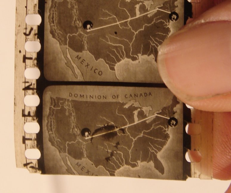
To run these movies required a projector aperture that was significantly smaller.
In the earlier days, say from about 1908 through about 1910, the projector aperture measured about .940" × 705",
but that proved untenable, as it revealed too many defects on screen.
Beginning sometime between about 1910 and 1912 newer projectors had apertures measuring about .90625" × .6796".
(If you’re in an arithmetical mood, that comes to about 29/32" × 87/128".)
You might also be interested in taking note of the odd sprocket holes.
They are Bell & Howell sprocket holes, which had a tendency to rip at the sharp corners, as you can readily see.
Yes, yes, yes, I know, all sprocket holes have a tendency to rip, but the Bell & Howell design was the worst.
I think it’s still being used, though, but mostly for camera negatives.
Shall we search for more examples? Yes, I think we should.
But examples are hard to find these days.
Fortunately, there’s something called eBay, and a seller by the name of
tomthewom
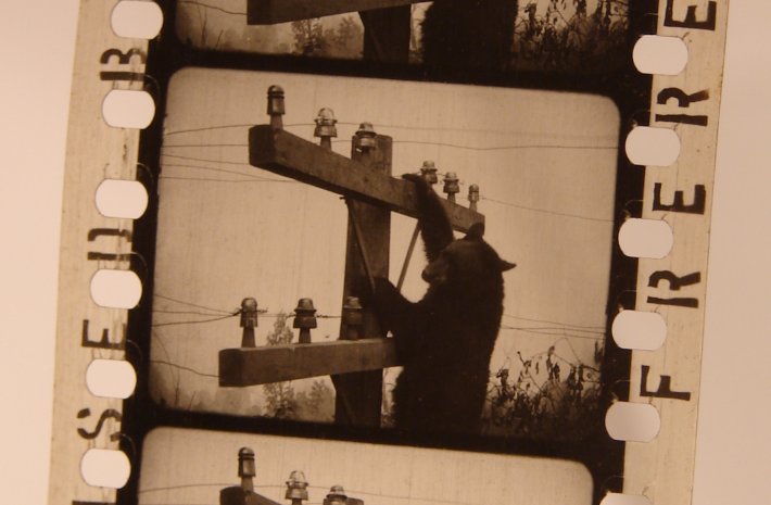
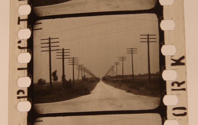
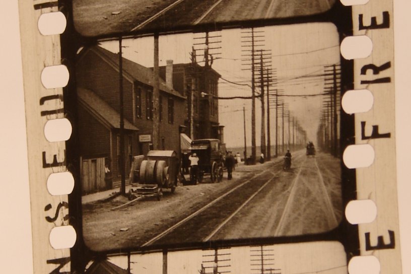
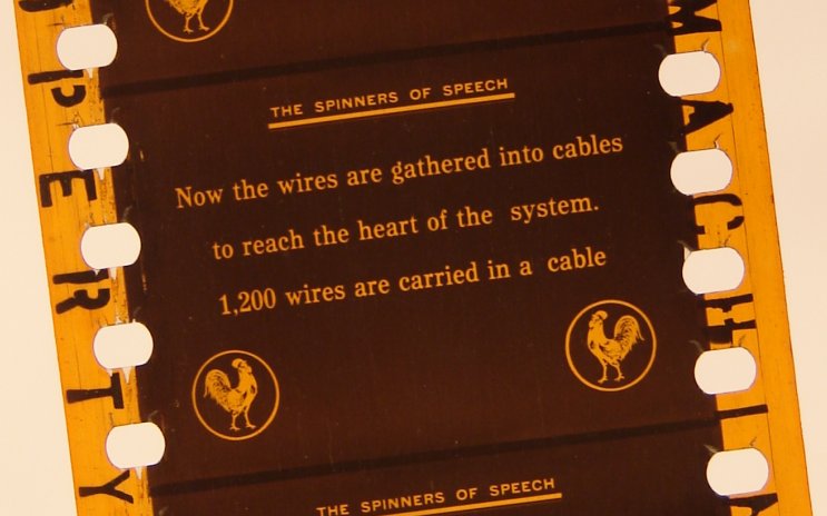
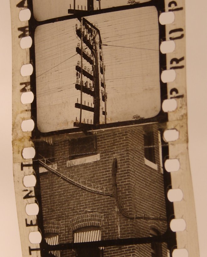
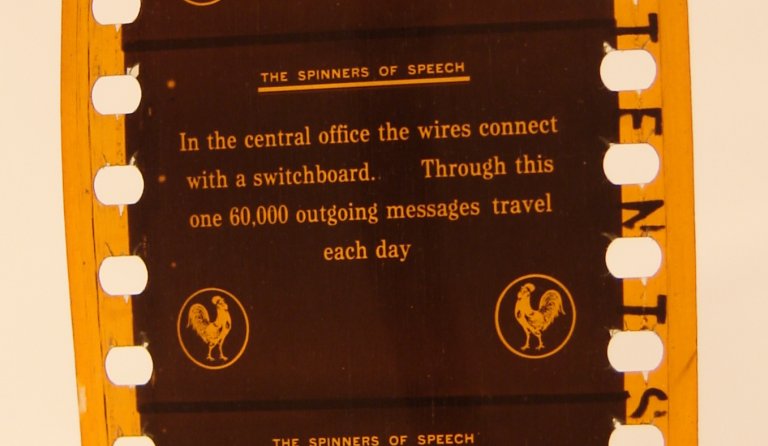
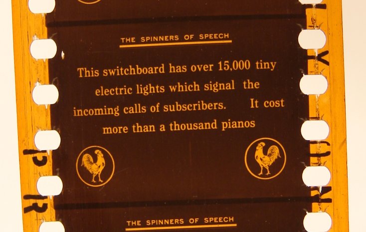
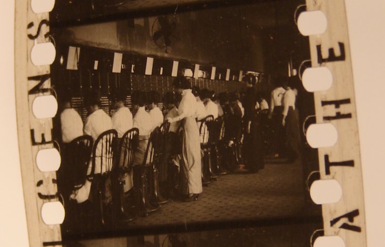
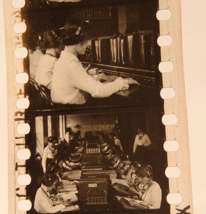
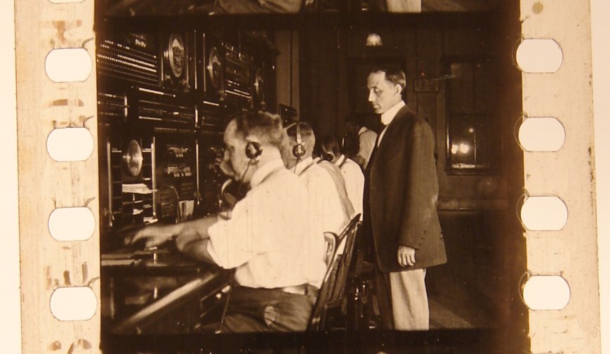
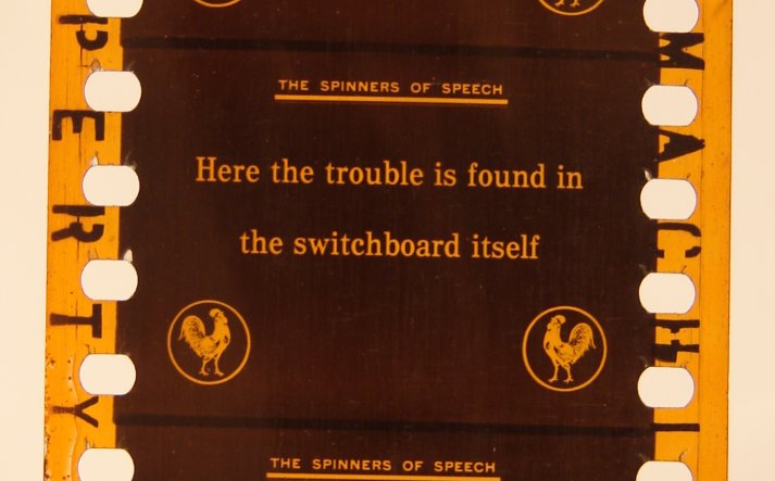
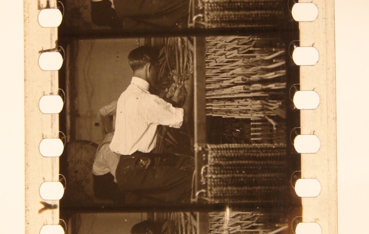
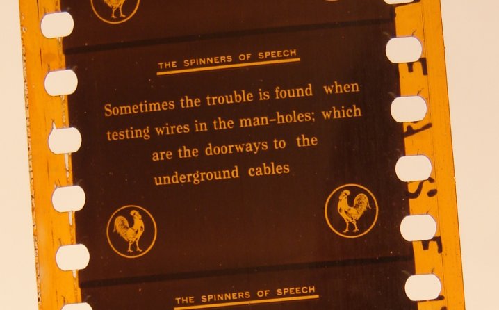
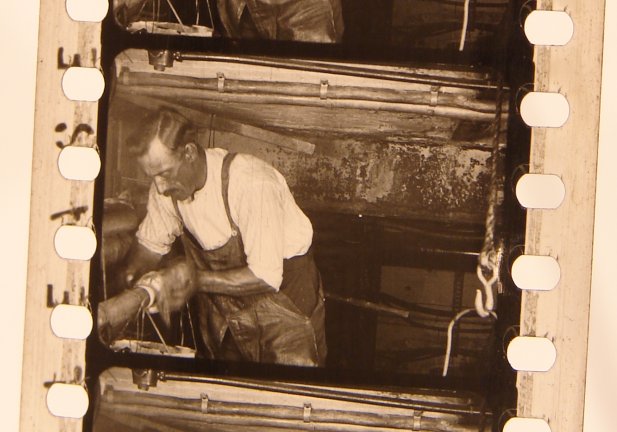
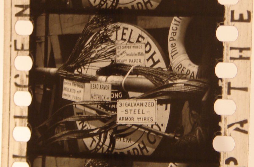
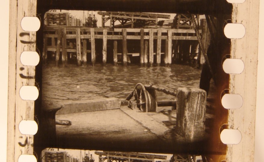
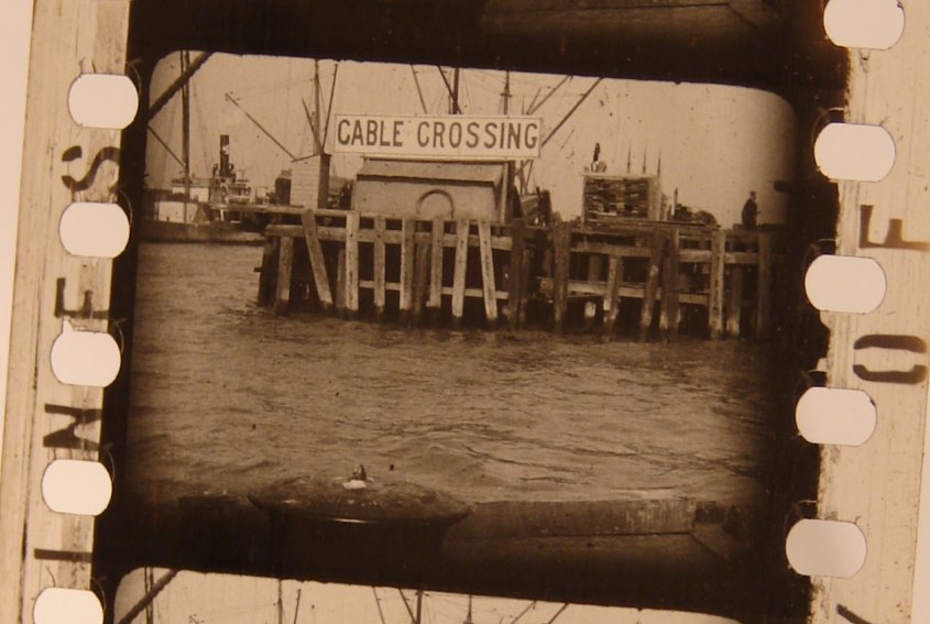
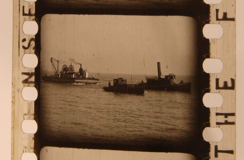
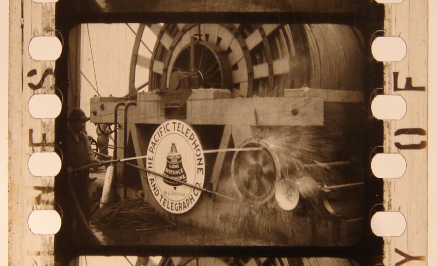
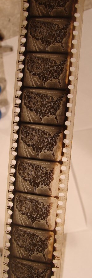
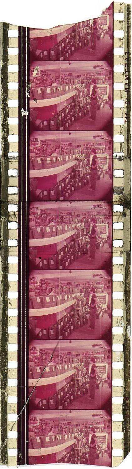
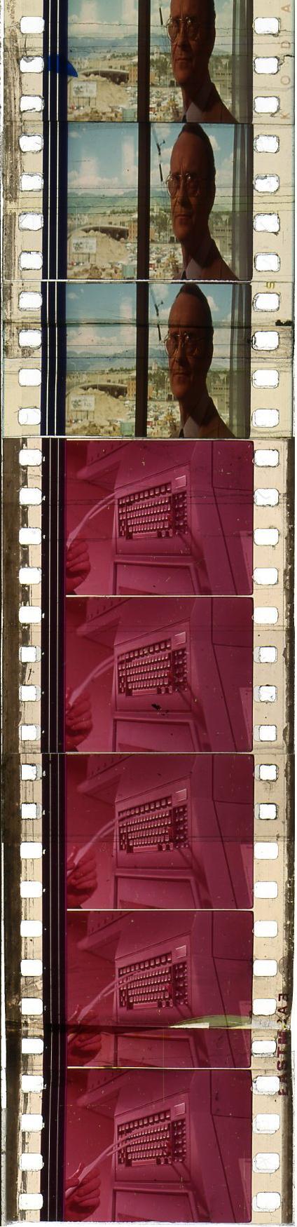
offered an obscure industrial film from 1913 by and about the Pacific Telephone and Telegraph Company.
And he had lots of illustrations.
After the bidding for item 390023133966 ended, I asked
tomthewom
if I could have permission to reproduce his illustrations on my site,
and he graciously consented.
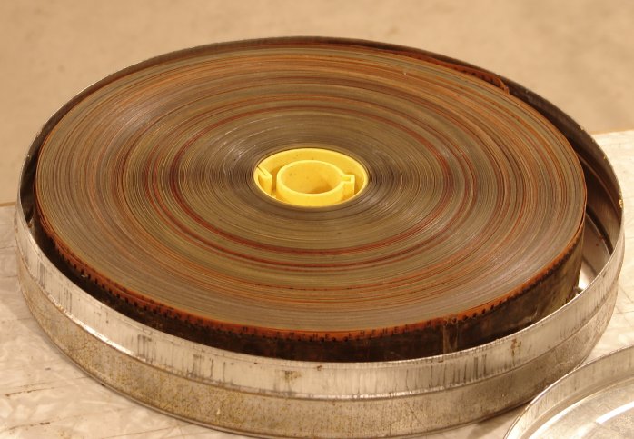
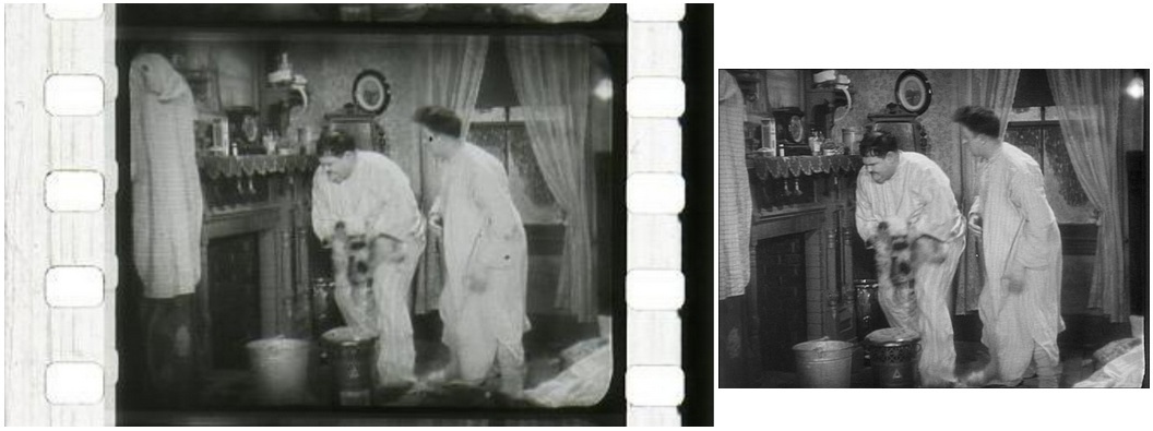
Here is the roll of film, wound onto a new plastic core and placed into a new metal can:
|
|
You can easily see that the color is not consistent.
It appears that different pieces of film, each differently colored,
were all spliced together onto this single roll.
And it looks that way because it is that way.
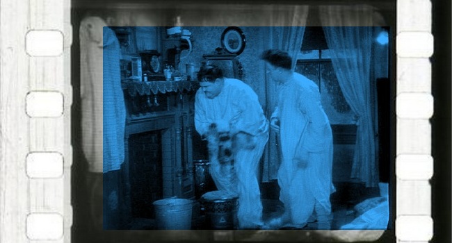
This film is tinted.
The negative was black and white, but different shots were dyed in different vats.
There were other methods of coloring films as well —
stenciling, toning, mordanting, pre-tinted film bases, and so forth.
You can learn more about this at
“Tinting and Toning,”
which has a copious selection of lovely illustrations.
|
|
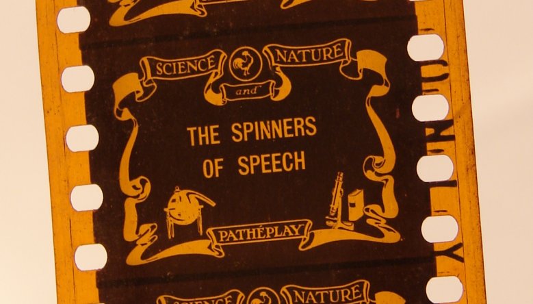
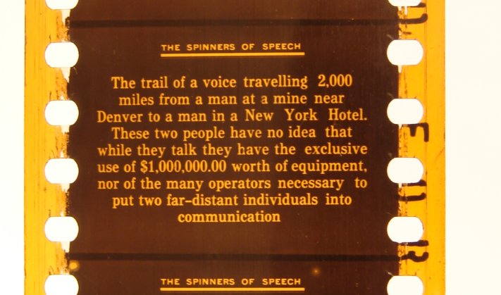
Above is the “main title.”
Note that the picture area goes about a quarter of the way into the sprocket-hole area,
and that the sprocket holes are the infamous Bell & Howell type,
which gave me nightmares when I was a projectionist,
not so much because of their fragility as because I never had a splicer that could handle them.
|
|
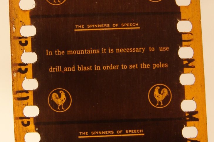
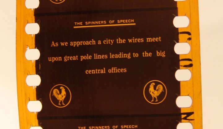
The above is a “title,” which in the world of silent movies
usually means something other than the name of the work.
A “title” was an explanatory gloss or a piece of dialogue that interrupted the visual flow.
Often these were called “subtitles,” to distinguish them from the “main titles,”
which came at the beginning and told the audiences what movie they were watching and who all made it for them.
Nowadays “subtitle” has come to mean something else altogether, namely, captioning,
usually at the bottom of the screen, usually as a translation.
To prevent confusion, archivists invented a new term, “intertitle,”
to describe what anyone in the silent days would have called simply a “title.”
I’m not happy with that neologism, partly because almost no one outside the small circle of archivists
will understand what it means, partly because it sounds peculiar, and partly because it reminds me of Interlaken
(a place I would like to visit some year).
|
|
Censors do this.
Distributors do this.
Studios do this.
And projectionists just cross their fingers and hope that the defaced and weakened film doesn’t break during the show.
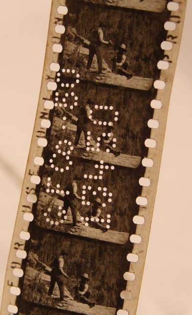
Look carefully, really carefully, at the sprocket holes in the above two snippets and you’ll see that they are torn upwards.
Actually they’re torn downwards, because the film runs through the projector upside-down,
and the lens flips the image right-side-up again.
This is the problem with sprocket holes, especially Bell & Howell sprocket holes:
the sprocket teeth, especially of the intermittent wheel and the holdback wheel, rip the films to shreds,
and it doesn’t take a lot of showings to do the damage.
Pay attention to the sprocket holes in all the images below, and you’ll see the same problem pop up over and over and over.
|
|
And now we finally get a really nice, up-close look at a frame of silent film.
You can see that the corners are rounded.
Not all corners are rounded, but the particular camera that took this shot had an aperture with rounded corners.
The image does not use all the room it could possibly fill,
but that’s all right, because no projector would or could have shown all .75" of height or 1" of width.
Projector apertures are and always were a smidgin smaller than the camera apertures,
partly to mask out the tell-tale splice lines, partly to allow for a fudge factor,
partly to compensate for film shrinkage, and partly to allow the projectionist to find a happy medium
that would never reveal the frame lines, whose position varied from camera to camera.
You can see that the sprocket holes do not quite line up with the sprocket holes on the negative,
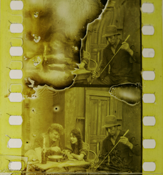
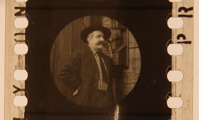
which are partly visible. Though the main title and other titles were dyed a deep yellow, the live-action scenes were dyed sepia.
Many people violently disagree with my assertion that movies are, in general, dangerous.
Those who disagree with me are apparently unaware of the methods used to achieve a sepia tint :
dyes made either of silver sulfide ferrocyanide or uranium ferrocyanide!
|
|
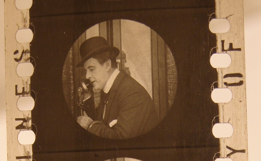
And above is another nice close image.
Compare the positioning of the frame lines in this shot with the positioning of the frame lines two shots above,
and also with the shot of the bear a few images below!
Not quite the same, is it?
|
|
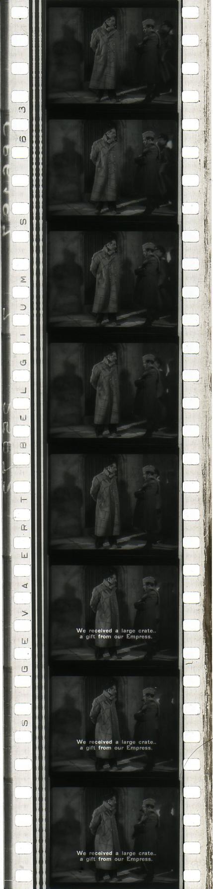
An investigator indeed!
Our investigation reveals that there were at least two cameras that made this movie,
not counting the third camera that shot the titles.
|
|
No, I can’t explain this anomaly.
There is an extra horizontal line at the very top of the frame, and above and below that line,
the gabled rooftop is doubled.
Strange, isn’t it?
|
|
Here finally we have an illustration of a join, or a splice.
This is almost certainly the work of a projectionist.
Splices made at the lab are generally much thinner, and often much more subject to breakage.
What must have happened here is that the original lab splice began to peel apart,
or perhaps snapped during a showing,
and the projectionist had to cut out the damaged frames (probably one at either side of the break)
and make a new splice.
This also illustrates the problem with cement splices.
To make a splice requires that the emulsion of part of one frame be scraped off to make way for the chemical adhesive,
which is then affixed over a portion of another frame as well.
It is therefore essential to delete a minimum of one frame every time you make a splice.
That is why I prefer tape splices, which rarely require the deletion of even one frame.
Of course, splicing tape wasn’t invented in the silent days.
That didn’t happen until — when?
The 1950’s? The 1960’s? I really don’t know.
But any splice, no matter how well-made, is thicker and stiffer than the film itself,
and throws the focus off for a minimum of two frames.
And because splices are thicker than the film, they also jump a bit on screen.
|
|
Above, between the two shots, is a different sort of splice.
This is a lab splice, considerably thinner than the splice that a projectionist would make.
But it’s not on the film itself.
The splice was made on the negative, and, as you can see,
if a projectionist were to show the very top and/or bottom of the frame,
there would be a brief flash on screen.
Now you can understand one of the reasons that projector apertures were always just a tiny bit smaller than the camera apertures.
Exhibitors did not want those little |
|
Hmmmmm. Do you begin to suspect that at least three cameras made this movie?
The positionings, the borders, and the corners are altogether different, aren’t they?
|
|
Again, take note of the doubling of the image at the top of the frame.
I really don’t understand how that happened.
To figure it out, I would have to examine the negative and the equipment used at the lab.
That trail is rather cold, isn’t it?
|
|
The above snippet is quite important,
for it provides us a good example of the beginning stages of decomposition,
along the right-hand side of the image.
|
|
If you studied the frames above carefully,
you now know more about silent movies than the majority of film historians and cinema professors.
You now know more about silent movies than nearly any projectionist on the planet.
And, unlike most scholars, you are ready to get increasingly angry by what you’ll see below.
|
|
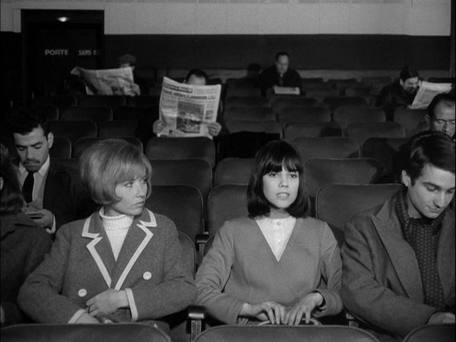
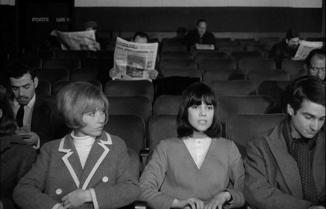
Above is another little snippet, and if you look carefully you’ll see that something is wrong.
As a matter of fact, several things are wrong.
Let’s go through them one by one.
First of all, the image is too small.
There is too much border at the sides, so much that it reveals an afterimage of the sprocket holes of the source material
(which in this case was not a negative but a positive!),
and you’ll see, with some difficulty, that the afterimages of the older sprocket holes are not quite evenly spaced,
there being slightly more room between the holes around the frame lines than within the frame.
Secondly, the top of each frame is duplicated.
Thirdly, this is not a silent movie;
it is a talkie called Laughing Gravy, which was released on 4 April 1931.
It was shot with the full silent frame because it was issued with synchronized sound on Vitaphone disc,
and so there was no need to reduce the picture size.
I found this little snippet when rummaging around in the projection booth at the Frauenthal Theatre in Muskegon.
Peculiarly, though, the print is rather modern safety stock.
This was definitely a reissue from the 1960’s or 1970’s.
That explains some of the anomalies.
Film shrinks, and it shrinks rapidly.
Nitrate (nitro-cellulose-based) films shrink more rapidly yet.
So when this new copy was made, it had to be step-printed
(printed one still frame at a time, rather than on a continuous printer)
to compensate for the shrinkage.
The shrinkage + the step-printing resulted in the further anomaly of duplicated frame tops.
Though I don’t understand the duplicated frame tops in the previous snippets of the Pacific Telephone and Telegraph Company,
I understand them here.
But this is what I don’t understand at all:
A reissue would have had the soundtrack printed directly onto the left side of the film,
because after the mid-1930’s Vitaphone bit the dust,
and almost no cinema in the world would have had the ability to play Vitaphone discs.
Further, even if two or three cinemas somewhere in Siberia or Ghana, after the mid-1930’s,
still had their Vitaphone equipment in working order,
no more Vitaphone discs were being made for release anymore, and any older discs would have been worn to uselessness.
So where precisely did this snippet come from? And why was it printed like this? Mystery!
The mystery, though, solves another problem.
If you’re dumb like me and file out your full-frame silent apertures to the old standard of .90625" × .6796"
you’ll see that you just made a howling error, because the old standard no longer works,
for all silent films —all, without exception! — have shrunken considerably.
It would be better to file several silent apertures, measuring .90000" across, each a little off-center in a different direction.
Can the IMDb solve this mystery?
Nope. The “Aspect Ratio” is given as “1.37 : 1” — as though that’s all we need to know.
Out of curiosity, I decided to check this snippet against
the 21-disc DVD box set available in the UK through Universal
(which is a great set by the way, except for one problem — or maybe two).
Let’s take a look —
film frame on the left, video capture on the right.
The reason the film frame is fuzzier is because my scanner is not the best.
So don’t worry yourself about that.
Just pay attention to the compositions:
|
|
Now, the video transfer lopped off the left side, the top, and the bottom.
Keep reading and you’ll understand why.
What I don’t understand is why the picture was also distorted,
squeezed slightly.
(I just heard from a video engineer who suggests that this might be the result
of the video-capture software that I used not dealing properly with
the “pixel aspect ratio,” or PAR.
See
Wikipedia and
Adobe Premier Pro CS4 * Aspect Ratios.
Always sumpn’....)
If we compensate by unsqueezing, we can overlap the two frames so that you can see the difference.
|
|
The snippet above comes from La grande illusion, which was shot with a 1.375:1 Academy aperture in the camera.
Depending upon how the projector’s aperture plate is filed,
this can be as narrow as about 1.31:1 (.800" × .610") or as wide as about 1.38:1 (.830" × .600").
For most movies, the small differences between .800" and .830", and/or between .600" and .610", make no real difference.
There is enough of a slop factor built in to most (emphasis on “most”) Academy-format movies
that any size between those two extremes will be perfectly okay.
Quite often the Academy frame format is referred to as 1.33:1, just as silent movies are 1.33:1.
As I repeatedly note, the popular slang term for Academy is “one-three-three.”
And so since silent movies are
Now, finally, you can see what monaural sound looks like. This is “bilateral monaural,” and the meaning should be obvious.
Additionally, it is variable-width, meaning that the sound is recorded and reproduced by the varying widths of the little microseconds of sound track.
|
|
This one really interests me. Again, it is shot with a 1.375:1 aperture in the camera, and again it is bilateral monaural,
but with a difference. Note the shape of the sound track. One edge of each half is straight, and the other provides the signal.
This is also variable-width, but this particular version is called a bilateral “sawtooth” track.
What this movie is, I don’t know.
I discovered this snippet, maybe 10 or 15 feet long, at Don Pancho’s Art Theatre in Albuquerque, back in 1978. And so I ran it.
The only words on those few seconds of film were:
“...the 1949 epidemic...” and then the snippet ran out.
It’s definitely from a newsreel of some sort.
The person in the frame always looked strangely familiar to me, but I’ve never been able to place him.
Another mystery.
The brown streak running down all the frames, toward the right, is oxidization.
There’s plenty more, and it’s quite plain, but it doesn’t come through in a scan.
Note that this is nitrate stock, which is highly unstable.
The emulsion gouge in the middle isn’t a gouge at all.
The base began to degrade, and the emulsion simply disappeared.
The projectionist allowed me to save these few frames for my collection.
|
|
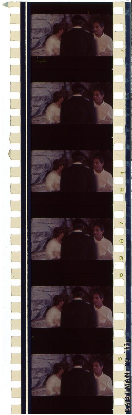
This is a damaged bit from a beautiful movie called
C’erevamo tanto amati (We All Loved Each Other So Much),
which came and went and is now almost forgotten.
But what a gem it was!
This particular shot takes place in the Trevi Fountain.
On the left is Stefania Sandrelli, and on the right is Nino Manfredi.
No idea who that is in the middle (I don’t think he was credited).
This was shot with a 1.85:1 aperture in the camera,
which was quite common in Italy back then.
Some of the other shots used a taller frame and were then masked to 1.85:1 in the laboratory.
The sound is obviously monaural, but it is not bilateral, as you can readily see.
If you check the specs on IMDb,
you will see that the “Aspect Ratio” is given as “1.66 : 1” — well, so much for official sources.
Oh wow. Look. This is finally on DVD in an
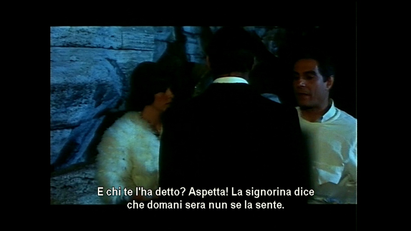
ANTONIO (narrating): Francamente noi altri ci proviamo un po’sempre colle ricoverate carucce, ma quella volta rimasi colpito da quel viso così delicato e... e... e subito domandai: ANTONIO: Signorina, dieta libera o cardiaca? PATIENT: Pure io vogghiu i cannolicchi. ANTONIO: Michele ci ha l’otospongiosi. Questo invece ha la pseudo tripanosomiasi, malattia del sonno a decorso benigno.
Good grief. I couldn’t even follow that in English if spoken slowly and enunciated clearly.
“Carucce” isn’t in the dictionary,
and “vogghiu” must be some regional variant of “voglio,” I guess. Maybe.
But anyway, it’s a great movie that put everybody to sleep the few times I saw it way back when.
It went on to win no awards (that I know of), never to be revived,
and now to be forgotten except by students at BYU who have no choice.
It makes its points quite well about how the new government is a Xerox copy of the old one,
about how we were fooled into fighting for all the wrong things,
how in order to thrive we need to sell out,
how sticking to our principles makes us completely ineffective,
and why friendship really doesn’t count for much.
Completely true, isn’t it?
But who wants to admit it?
Gets you depressed, doesn’t it?
Despite its downbeat take on life,
it’s really about the warmest, most moving, involving, beautiful story I’ve ever seen.
And it shows
Here’s the above sequence on the DVD:
|
|
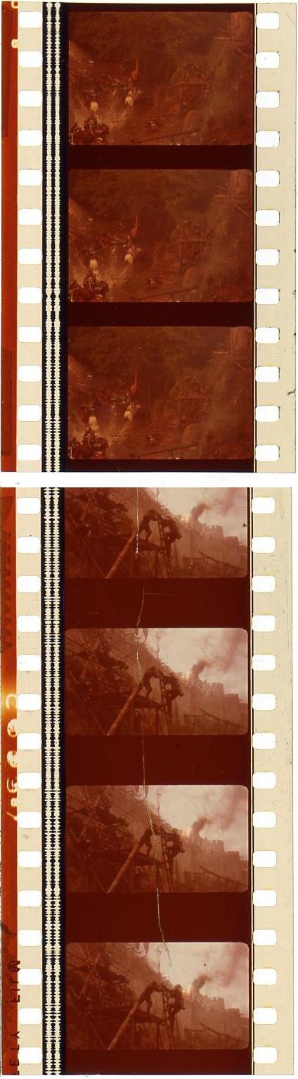
Here are two snippets from Excalibur, which Wolf Mankowitz denounced as the work of a fascist.
Maybe I missed something, but that’s not what I got out of it at all.
Anyway, the snippet at the top was shot with a 1.375:1 aperture in the camera, but it should not be shown that way.
It needs to be cropped.
The snippet on the bottom reveals why:
Much of the rest of the movie was shot with a 1.66:1 aperture in the camera.
The whole movie should properly be shown at 1.66:1.
And that, of course, is why the 16mm prints and videos were wrongly matted at 1.85:1, ruining the compositions.
And indeed, the IMDb erroneously lists the
“Aspect Ratio” as “1.85 : 1” — sigh....
|
|
I can’t remember what this movie was called.
It was Méxican, and the print I ran was so brittle that it crumbled as it came off the feed reel.
I had to give up and ship it back.
But what I saw was hilarious.
It dealt with a priest who worked with juvenile gangs.
And he was always having such fun, riding his motorcycle and singing catchy little songs all the time.
If you can identify this movie, please write to me. Thanks!
But back to the matter at hand.
As you can see, it was shot with a 1.375:1 aperture in the camera.
And, as you can see, it would be wrong to project it that way.
Note the wasted space at the top and bottom of the frame.
That was meant to be cropped away.
This film should properly be projected at 1.66:1.
|
|
This one is really interesting. As you can see, the shot at the top is 1.375:1 in the camera.
Then the next shot (you can see the laboratory splice made in the negative) is taller.
It is the old-fashioned MovieTone, or Photophone, format.
But pay attention.
You can see that the corners on the right side of the frame are rounded,
but that the corners on the left side of the frame are square.
That’s because this particular shot used the full-frame silent aperture.
The camera operator made sure to keep the important stuff out of the left side,
because anything on the left side would be cropped off in the lab to make way for the sound track.
You’ll notice, once again, in both shots, that there is wasted space at the top and bottom of the frame.
This is certainly composed for a 1.85:1 crop.
Let’s pull a single frame:
|
|
Let’s chop it down to 1.85:1 to see how much better it looks with the intended crop:
|
|
Let’s pretend we’re watching it at a cinema where the projectionist has made a mistake:
|
|
Let’s suppose that the projectionist has just noticed his mistake, and makes an attempt to correct it:
|
|
Or let’s pretend the projectionist has made the opposite mistake:
|
|
And let’s similarly suppose that the projectionist has just noticed this mistake, and makes this attempt to correct it:
|
 |
 Side A of the DVD, which the labeling implies is the original  Side B of the DVD, which opens with a warning that this has been modified from the original version to fit your TV screen |
|
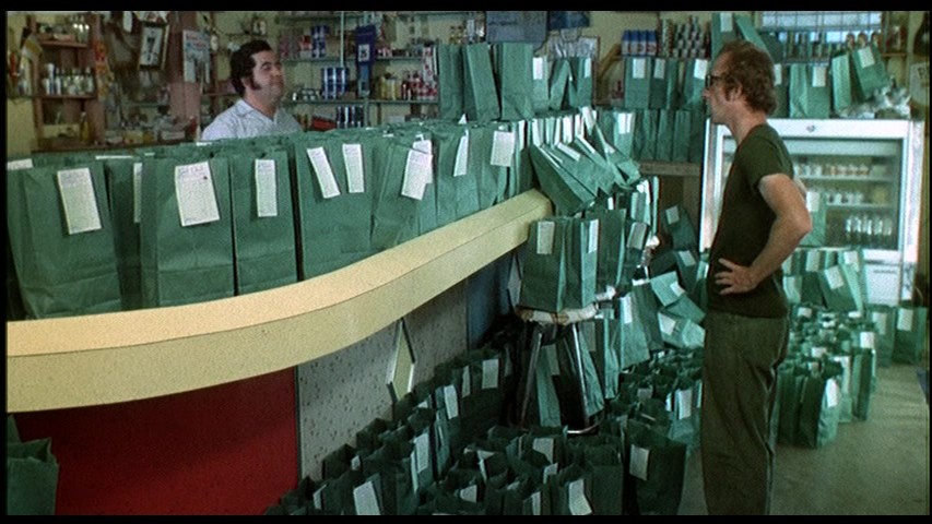
Bananas, a movie I highly recommend.
On the left is a battered piece that reveals the shadow of the lens barrel, which is cropped out when shown on cinema screens.
The previous projectionist chopped this little snippet out, fearing it would not withstand projection.
The pieces he didn’t cut out weren’t much better.
Oh what a dreadful print that was.
The previous projectionist also deliberately miscued the reels and deliberately remade some splices out of frame, just to mess me up.
As I ran the movie, I flagged every bit that went wrong and, sweating bullets, respliced and recued in time for the next show.
So when the previous projectionist returned to run the evening show, everything went swimmingly.
That was a running gag.
The manager would see that the previous show was fine,
that when I came in there was a disaster,
and that when the next projectionist came in everything was fine again.
I was fired for that.
Yes, that was indeed a running gag, and happened for at least half of the shows I ran at that particular cinema.
Could I have played the game differently?
Yes, I could have.
I could have left the films alone, so that the next projectionist would have had unprojectable films on his hands.
But then he would have accused me of ruining the films, and I would have been fired anyway.
Odd thing is that, wherever I go, people find that I’m remarkably calm and soft-spoken and helpful and forgiving.
But the movie and theatre and showbiz worlds are absolutely vicious,
and the hateful behavior rubs off on me,
and I end up being as bitter and as obnoxious as everyone else.
You can see vestiges of my foul attitude in this essay, can’t you?
And believe me, even if you work for the most wonderful boss (yes, there are a few in the movie world — very few),
you’ll still develop a rotten attitude, because you’ll be surrounded night and day by movies.
Movies are not healthy to be around. Oh, yes, a few of them are nice, a few of them are educational, a few of them are delightful,
a few of them are insightful, a few of them are even transformative,
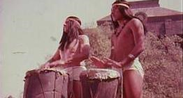
but most of them are designed to turn you into robots who think that the indigenous peoples of the USA are white Europeans
and that everyone else is scary or dumb — or both.
|
 |
  From the DVD I can’t readily find this shot on the DVD, but it must be there |
|
Another one of my favorite movies.
The Man Who Fell to Earth.
2.39:1 anamorphic. Shown with anamorphic lenses, the picture will stretch out twice as wide as it appears here.
These are two shattered reel ends that a projectionist chopped out and that I rescued from the rubbish bin and joined together.
I remember that when I ran this movie, on every leader and tail was large handwriting:
“SHORT VERSION — R,” and that led me to assume that,
somewhere on this planet, there was a “Long Version — X,”
and it turned out that I was right, sort of.
I went to see this movie again when it played at the Galleria Twin in downtown Albuquerque.
That was a strange experience. It was still the R version, and I remember having a hard time following the story.
I kept seeking out the symbolism, and I was quite convinced that director Nicolas Roeg was an occultist of some sort —
a Theosophist, maybe? And screenwriter Paul Mayersberg was possibly one too.
Hard to tell because the symbolic hints seem all to have been added in the visuals, and may not have existed on the printed page.
The movie dealt, subtly, ever so subtly, with confusions of time and space and identity.
Characters seemed not merely to influence one another, but actually to become one another.
But that aspect of the narrative was so underplayed that not one person in five thousand would pick up on it.
Now, what made viewing the movie that afternoon even stranger was that the cinema in which I was viewing it was nearly in the movie.
At the beginning, David Bowie is being driven in a limousine through the streets of Manhattan.
But what we see was obviously a pick-up shot, filmed in Albuquerque, with the Galleria Building in the background.
In the top snippet above, we see Buck Henry occupying an office in the Galleria Building, maybe on the third floor or so.
To this day I recall the construction going on in the background.
And later on, when Bowie escapes from the prison improvised inside the (then historic but since plundered) Hotel Plaza, he walks down
the street and, just barely hidden around the corner, just by inches, is the entrance to the Galleria Twin Cinema in the Galleria Building.
If only the camera had moved a little further up and just a tad to the right, we would have seen the glass bubble on the left,
which led to the staircase down to the basement cinema. Alas, that is a cinematic moment that never happened. Drat!
So it was as though the movie was mixing itself into my life. Or vice versa.
To mix it up even more, some time ago I got to know Buck Henry ever so slightly.
Back in 1974 when this movie was filming in downtown Albuquerque, I had no interest whatsoever in witnessing it.
My interests were pretty much in silents and early talkies,
and I was actually a little bit annoyed that people were making a fuss about a modern film.
What a mistake!
I should have taken the bus to see all the action.
I’ll never get that chance again.
Now, my notes from back in 1978 indicate that though the print I ran was optical monaural,
the original was
The IMDb lists this film as
having an “Aspect Ratio” of “2.35 : 1” — which is close enough, I guess.
Actually, though, if you run it with the old-fashioned 2.35:1 aperture, you’ll get frameline flashes at a few of the edits.
So it’s a bit better to run it with the revised 2.39:1 aperture — even though that will likely crop off the very
top of the skyscraper in the transition shot leading into Professor Peter Prouse’s only scene.
(The skyscraper, by the way, was the downtown Albuquerque post office, or “DTS” to use local Postalese.
And I kept on running past Peter Prouse in the hallways when I was a student at UNM,
but I never exchanged even one word with him. Oh well....)
|
WHAT IT LOOKS LIKE ON THE FILM |
WHAT THE ANAMORPHIC LENS DOES TO IT |
|
Just so that you can see what happens. I can’t identify this movie.
Definitely Méxican. Definitely a Cantinflas vehicle. I probably ran it.
Note, once again, that it was shot with the old-fashioned silent aperture.
The give-away is that the corners on the right side are rounded, but that the corners on the left are square.
The left side was truncated.
I see that Kristin Thompson and David Bordwell have written on this topic as well.
Take a look at their blog.
(Kate MacKay still works at the Cinémathèque Ontario? Wow! Hi Kate!)
Now, Thompson and Bordwell were curious that Godard himself stated that the movies he composed for 1.375:1 should ideally be cropped at 1.66:1.
There’s nothing surprising about that.
I remember at a SMPTE conference Victor J Kemper, a Hollywood cinematographer, made the point that he composes all his films for a 1.85:1 crop,
as do all Hollywood cinematographers.
When he finished his lecture, I went up to him and, despite fearing that this might provoke a fight and get me barred from SMPTE forever,
I said that I begged to differ, but that most Hollywood movies were actually being composed for a 1.66:1 crop at that time (mid-1980’s through about 1991).
Instead of punching me in the nose, he just looked confused and after a little hesitation said I was probably right.
He apparently just followed the markings in the viewfinder and assumed that they were 1.85:1, and assumed that everyone else was doing the same.
And some of his movies were indeed composed for a 1.85:1 crop
(Dog Day Afternoon, National Lampoon’s Vacation, Pee-Wee’s Big Adventure, and so forth).
I should have mentioned to him that See No Evil, Hear No Evil was matted in the lab correctly at 1.75:1, but I never got that far in my argument.
There’s also another problem, namely, the instructions that come with some movies.
Most movies do not come with any instructions.
And we would be better off if no movies at all came with instructions.
From my years as a projectionist, I can vouch that I saw correct instructions only once or twice.
Almost all the instructions were as wrong as wrong could be.
Yes, films labeled “SCOPE” are generally 2.39:1 anamorphic,
and films labeled “FLAT” are generally something other than 2.39:1 anamorphic,
but that’s really the extent of the accuracy.
If the instructions say specifically that a movie is 2.39:1 anamorphic, you can bet that it is anything but that.
If the instructions say 1.85:1, count on the movie being more likely 1.66:1 or even 1.375:1.
If the instructions say 1.375:1, count on the movie being silent or 1.18:1 or 2.39:1 or something else.
If the instructions for The Little Mermaid warn the projectionist that the entire exposed frame is preserved on the release prints
and that the reference markings will show up if shown at anything taller than 1.85:1,
rest assured that the entire frame is not preserved but was matted to 1.66:1 at the lab,
that no reference marks are visible at all, and that a 1.85:1 crop would be ruinous.
If the instructions say “MONO,” rest assured that the film is actually
There’s another movie that drove me nuts.
When I was sixteen I thought A Clockwork Orange was a work of genius.
I saw it again a decade and a half later and I thought it was an offensive piece of junk.
Opinions aside, though, that’s not what drove me crazy.
This is what drove me crazy.
Nearly the entire movie was shot with a fisheye lens.
Much of the film was shot with a 1.66:1 aperture in the camera,
but cinematographer John Alcott needed better to judge the distortion as he was filming,
and so he shot some of the movie with the Academy 1.375:1 aperture.
No matter which aperture he was using at the moment, he designed every shot with a 1.85:1 crop in mind.
Stanley Kubrick, the director, filmed the handheld sequences himself,
with a 1.66:1 aperture in the camera, and he made no provision for a 1.85:1 crop.
Most of the 1.375:1 shots were then hard-matted to 1.66:1 in the lab.
So if you run it at 1.66:1, it looks sloppy except for the handheld shots.
And if you run the movie at 1.85:1, it looks perfect except for the handheld shots.
At 1.85:1 you lose the brief image of the murdered “Cat Lady” revealing no damage to her face,
an important bit of emotional distancing.
When you don’t see her, you imagine the worst and it’s just too much.
Unfortunately, the DVD version in the “Stanley Kubrick Collection” mostly crops this off,
which leaves me helpless to demonstrate the difference.
|
 |
|
Fortunately, the “Two-Disc Special Edition” shows some more image, though not much more.
Unless my memory is playing tricks on me,
there is more image on the film than what you see on either of these DVDs.
Improperly projected at 1.85:1 you don’t see the deceased “Cat Lady” at all.
|
 |
 |
| As it appears on the “Two-Disc Special Edition” DVD set, which does NOT seem to be the entire image on the actual film frame. | At 1.85:1 it would look more or less like this, sort of. |
|
When Kubrick negotiated with Warner Bros., he wanted assurance that US cinemas would project the film at 1.66:1.
Why he thought they would, I don’t know, because they didn’t — and couldn’t.
A Clockwork Orange was also the beginning of the dreadful era of harsh sound.
It was the first movie recorded with Dolby noise reduction, which should have made it sound better,
but for some reason made it sound tinny and painful to listen to.
Many moons ago I read somewhere that the original prints were actually Dolby A stereo, but
Now that we’re musing about Kubrick, let’s talk about Dr Strangelove,
which was his best movie, and really one of the best movies ever made, thanks largely to Terry Southern and Peter Sellers.
Kubrick shot half the movie at full-frame and half at Academy, but designed it all for a 1.75:1 crop.
He then instructed the lab to matte selected sections to 1.66:1 and to leave the rest alone,
and he sent out instructions to the projectionists of the world to project the film at Academy and let the black bars at the top and bottom show.
Nobody listened (except for me — I obeyed).
I’m not sure, but I think he also wanted the same for Lolita, and so I ran that at Academy too.
(Horrifyingly disturbing movie. Good, I guess, but so distressing to watch that it was days before I recovered.)
He shot The Shining full-frame (same as silent, though ultimately lopped of course to MovieTone 1.18:1 for the release prints),
composed it for a 1.85:1 crop,
and sent out instructions for projectionists to run it at Academy 1.375:1.
Nobody listened.
I presume that the instruction sheet asked the projectionists to raise the frame as high as they could,
to get all the bottom of the image and crop off the top.
You’ll see what I mean in just a moment.
When he released The Shining on video, the left side was still missing, of course, as it should have been,
but he did what I just said: raised the picture to crop off the top but reveal more of the bottom.
It actually looks better that way, though it’s still a really dumb movie.
Eyes Wide Shut (pretty funny movie, really; I liked that one) was shot the same way,
but matted at 1.85:1 on the release prints, and then initially released |
|
|
 |
| As it appears on the film, approx 1.20:1 or 1.18:1 or 1.22:1 or whatever. |
Properly cropped to 1.85:1 at the cinema, it would look like this. |
Reframed for a 1.33:1 |
|
In my humble opinion, no sane person could possibly object to such a “full-screen” video transfer.
Everything you need to see is there.
You see more than you would at the cinema.
And it looks balanced and well-composed.
Now, in fairness, I cannot say whether the entirety of The Shining and Eyes Wide Shut
was reframed thus for the |
 |
 |
 |
| Simulation of original frame, approx 1.20:1 | 1.85:1 cinema crop | Full-screen video, approx 1.33:1 |
 |
 |
 |
| Simulation of original frame, approx 1.20:1 | 1.85:1 cinema crop | Full-screen video, approx 1.33:1 |
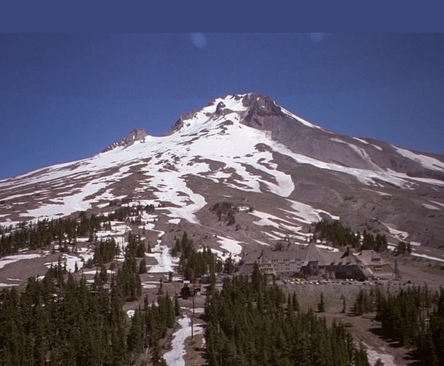
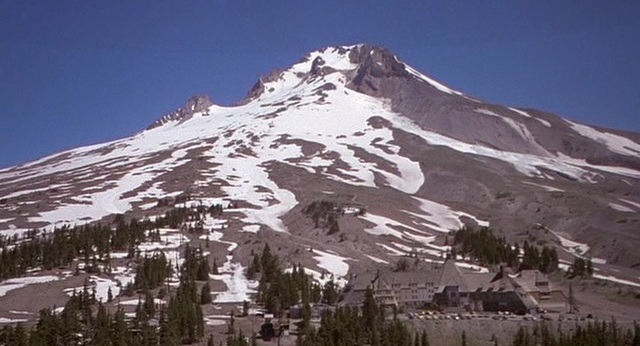
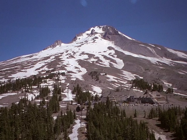
| The Timberline Lodge on Mount Hood, Oregon. | ||
|
If I can ever get my hands on a 35mm print, I’ll scan the actual frames and settle the matter once and for all.
And then many Kubrick fans may still ignore everything I’ve said and demonstrated
and get back to their bickering.
And just for good measure, here’s a title, again with my simulation of the (approx) 1.18:1 image on the film,
my simulation of a 1.85:1 crop, and Kubrick’s |
 |
 |
 |
| If memory serves, the VHS edition went to the other extreme, with the titles too high. | ||
|
I hear tell that the 1.85:1 |
|
 |
| Properly cropped at the cinema. | Improperly transferred to widescreen video. |
|
Please don’t ask me about Full Metal Jacket,
though I’m pretty sure it was shot and transferred the same way as
The Shining and Eyes Wide Shut.
I don’t know for sure. I don’t care to know.
I loved the book it was based on, and so I saw the movie when it first came out.
Wretched travesty, embarrassingly bad in every way. That was enough.
Yes, I have it on DVD, but I’ll never watch it.
The only good thing I can say is that if I hadn’t known about the movie,
I would never have known about the book.
The book was definitely worth reading. Definitely.
Only to finish the topic, here’s a little curio about 2001: A Space Odyssey.
The 70mm release prints, designed to be shown on deeply curved Cinerama screens,
were printed with optical distortion in several shots.
The curvature of the screen would correct that distortion.
Here’s an example.
The astronauts are oddly scrunched:
|
 |
|
When I saw the movie reissued in 1976 in 35mm that distortion was retained,
and so I was puzzled when I read (somewhere — I don’t remember where)
that the earlier 35mm prints from 1969 had no distortion.
Then back in 2001 (yes — on HAL’s birthday, actually) I ran a faded-to-pink 16mm print,
and to my surprise there was no distortion at all!
The two astronauts were perfectly proportioned!
The end credits were also |
 |
|
Enough of Kubrick.
I went on at such length not out of my own obsession,
but only as a response to the endless bickering and the endlessly repeated bad info that’s published all over the place.
Let’s move on to Pier Paolo Pasolini.
The Pasolini Foundation wrote strict instructions that all the Pasolini movies MUST be projected at 1.85:1.
Never mind that La rabbia and Soppralluoghi in Palestina and Appunti per un film sull’India and
Appunti per un’Orestiada africana and Le mura di Sana are all 1.375:1 and cannot withstand any crop whatsoever,
and never mind that Amore e rabbia is 2.39:1 anamorphic.
The projectionists at the AGO’s Jackman Hall, to their credit, laughingly ignored those instructions,
citing them as further proof that the people who run the movie business don’t know anything about it.
I remember that Jim Card told me the story that he told so many people and that he ultimately put into his book,
about his revival of The Docks of New York.
The clueless projectionists had set the machines to run at 16 frames per second, though the movie was shot at speeds above 21 frames per second.
The rulers of the archive decreed that all silent movies be run at 16fps no matter what. It was a matter of dogma, and was not to be questioned.
(No post-1922 commercial movie was shown at 16fps, despite what all the contemporary manuals tell you.)
Jim was terribly fearful of what the movie would look like at that speed.
He approached the film’s director, Joseph von Sternberg, who was in the auditorium that night for the special occasion.
Jim said that “The projectionists won’t listen to me but they’ll listen to you.”
He asked von Sternberg to go to the booth and tell the projectionists to run the film at the modern sound speed of 24 frames per second,
but the director responded, “What are you talking about? This is a silent film! It should be run at 16 frames per second!”
Jim was stunned almost to speechlessness. He did manage to say, hesitantly, though, “But you were cranking faster in 1928...”.
“What do you mean ‘cranking’?”
And Jim’s heart sank.
He sat down and braced himself for the worst.
Fortunately von Sternberg began to worry as well, and just before curtain time he approached Jim saying,
“You know this movie better than I do. It sounds crazy, but if you say it should be 24, tell them to run it at 24.”
Jim was relieved and elated and bounded to the booth: “Run it at 24! Run it at 24!”
The movie seemed perfectly naturalistic at that speed, and the audience loved it.
When it was over, von Sternberg leaned over to Jim and whispered a gruff “Thank you!”
That reminds me: Someday I’ve got to write about variable-speed projection for silent movies.
That’s another topic about which there’s almost nothing but misinformation
published largely by people who base their arguments on æsthetics and other such subjective nonsense,
and who think that what applied to an MGM picture of 1928 would have applied to a Hungarian indie of 1917
or a Keystone of 1914 or a Biograph of 1912 or an UFA of 1921.
Wrong! Not even close! The answers to that seemingly simple problem lie almost entirely
in the mechanical limitations of different machines manufactured at different times in different markets,
which is an entirely objective argument. Someday I’ll get around to that,
but I get exhausted just thinking about what it would take to commit all that to writing.
And nothing makes movie buffs’ blood boil as much as the topic of variable speed.
I should win several tens of thousands of enemies once I publish that little essay.
So be it.
I’ll give you a sneak preview, though.
If you are running a hand-cranked movie projector, you will discover that at less than about 15 frames/second,
the fire shutter drops, and at more than about 17 frames/second, the projector wobbles so violently that you risk knocking it over.
Motorized projectors could be run at faster speeds,
and so once motors were on the market (1907? 1908? I don’t know) the usual projection speed became 70'/min —
at those cinemas that had installed motors, of course.
That’s why The Birth of a Nation was 165 minutes rather than 190 minutes.
Then late 1921 happened.
1921 was the big year.
Of course, you all know what happened in 1921, don’t you? You should have learned this in seventh-grade history class.
It was in the autumn of 1921 that
For those who are curious, and especially for those who are not:
Well, getting back to the frame grabs of Godard DVDs
that Kristin Thompson and David Bordwell provide on their blog,
we see that some of them are cropped a bit less than we would expect, but are stretched to fill the wide frame.
This is unforgiveable.
But I knew it was coming.
Back when I was a member of SMPTE (early 1990’s) there was quite active talk about how Academy images
(no mention of silent or MovieTone, which the SMPTE folks seemed to have been unaware of)
should be transferred for viewing on widescreen TVs,
and the preferred answer was to stretch them, subtly.
A computer could be programmed to keep the center looking normal but the sides could be flared out so gently that nobody would notice.
What a crock.
True, most people won’t notice, but I am not most people, and I most certainly would notice,
and I wouldn’t be able to watch a movie upon which such an atrocity had been performed.
I had not seen an example of this until I saw the frame grabs on the blog. Ugh.
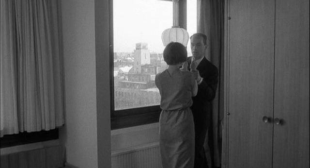
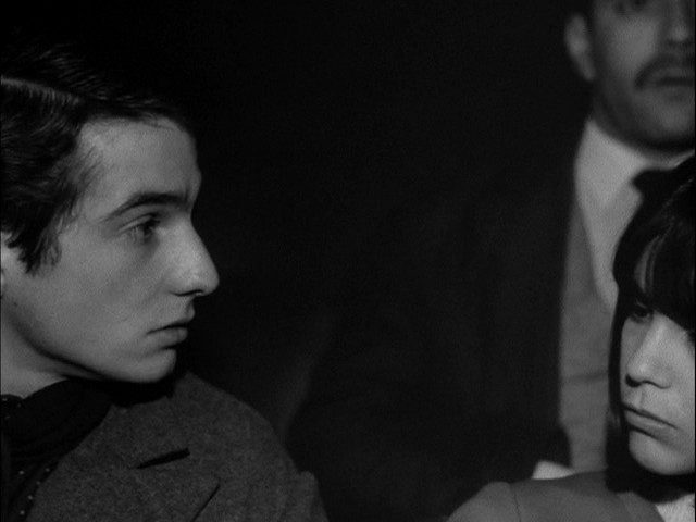
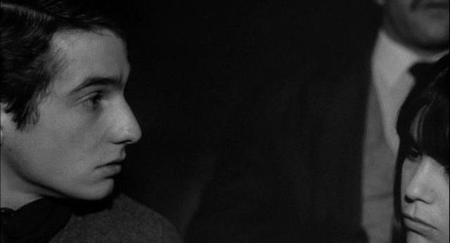
Anyway, to return to Thompson and Bordwell’s question, let’s watch the interview with cinematographer Willy Kurant,
which we can see on the supplement to the Criterion edition of Masculin féminin.
Be sure to remember that 1.375:1 is often colloquially called |
| The Academy frame, more or less, as it appears on the Criterion DVD Click on any image to enlarge |
More or less as it would have been cropped at French cinemas at the time Click on any image to enlarge |
More or less as it would have been cropped at US cinemas at the time Click on any image to enlarge |
 |
 |
 |
 |
 |
 |
| Note that you can see the projectionist through a porthole window | Note that you can’t see the projectionist through a porthole window | |
 |
 |
 |
|
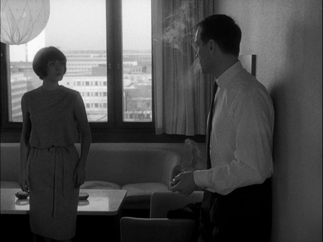
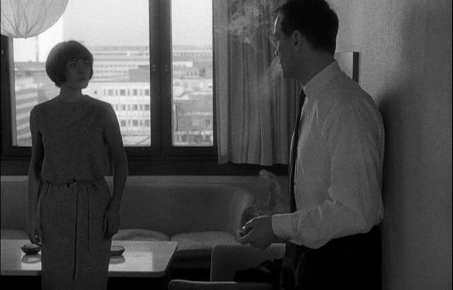
Interestingly, in the movie Masculin féminin itself,
the lead characters are ushered into a hideous Bauhaus cinema,
to watch a hideous, sickening, dreary, depressing, antihuman “erotic” movie.
One gal is disappointed that the movie is not dubbed into French but has subtitles instead
(but when we are shown what’s on screen, we are seeing it in direct sound in French!).
|
 |
 |
 |
 |
 |
 |
 |
 |
 |
 |
 |
 |
 |
 |
 |
|
The film within the film is obviously composed for a 1.85:1 crop,
and we are seeing it however our local cinema happens to be playing it.
|
 |
 |
 |
 |
 |
 |
| Typical Godardian framing, revealing a | ||
 |
 |
 |
|
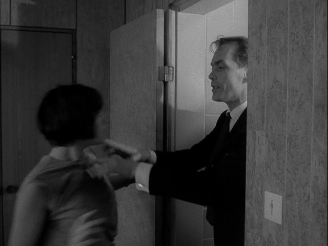
Jean-Pierre Léaud’s character suddenly bursts out, “Oh s__t! It’s in the wrong format!”
Chantal Goya’s character couldn’t care less: “And so what?”
To which JPL responds, “And so I’m going to complain.”
|
 |
 |
 |
|
He dashes out of the hideous auditorium, out of the hideous building, around the side,
up the hideous staircase, and bursts into the hideous projection booth...
|
 |
 |
 |
|
...where he reads from a small printed paper to the projectionist who ignores his very presence.
|
 |
 |
 |
|
JPL nonetheless declaims: “The aperture must be for a 1.65 or 1.75 aspect ratio, as decided during the film’s shooting.
The 1.85 format is a limit that should not be exceeded, as per the international recommendation of the ISO.”
|
 |
 |
 |
|
And then he dashes away again, though he has accomplished nothing at all, and the film progresses as before.
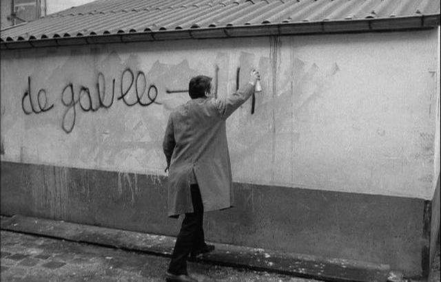
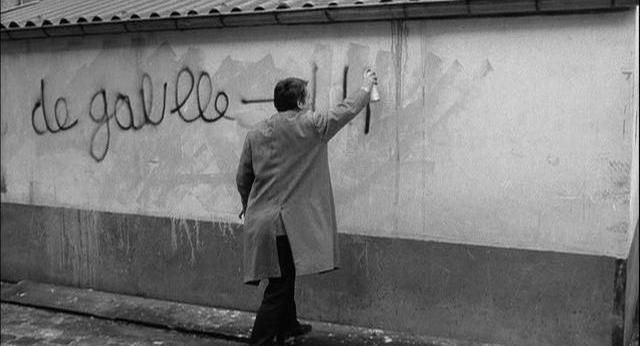
On his way back to the auditorium, he takes a moment to spraypaint a graffito on the hideous wall of the hideous building:
“de gaulle = UBU,” though the censors cut the shot just short of revealing the final two letters of UBU,
a reference to Ubu Roi, a surrealist play by Alfred Jarry.
I was so hoping that Criterion would restore this missing bit, but it might be lost forever.
Note that Léaud is spraypainting a graffito where previous graffiti enjoyed short lives.
Is this evidence of multiple takes, with Léaud’s previous spraypaint jobs covered over?
No, I don’t think so.
I think this was done in one take, and that the previous sloppy drippy cover-overs were just the work of
underpaid maintenance guys who were doing a heartless job of erasing previous gang-related graffiti.
JPL returns to the auditorium, and we are shown more of the film within the film, and now it is composed for 1.375:1.
As you can see, cropping is no longer comfortable here.
(Why do all these anti-corporate radicals smoke so much?)
|
 |
 |
 |
 |
 |
 |
 |
 |
 |
 |
 |
 |
 |
 |
 |
 |
 |
 |
| Why the charmed reaction to this dreadful movie-within-a-movie? Simple. Godard told her that her character would be shown watching Gone with the Wind! | ||
 |
 |
 |
 |
 |
 |
|
So, finally, in answer to Thompson and Bordwell’s question, the answer is simple:
Godard was wrong, and the movies he shot at 1.375:1 should be shown that way.
End of story. And when I say “end of story,” I mean here’s some more.
Here’s a frame |
|
Projectors, if properly calibrated (ha ha ha ha ha),
will shave just a tiny bit off of the four sides, resulting in something like this:
|
|
If we follow Godard’s advice and run it at 1.66:1, it will look like this:
|
|
And if a DVD distributor were to issue a “deluxe widescreen letterboxed edition” at 1.78:1
(fortunately this has not happened and
the DVD is 1.375:1
or thereabouts),
it would look like this:
|
|
And if we were to mosey on down to our local “art” house to watch it at 1.85:1,
it would look like this:
|
|
And if we go to a typical multiplex that might
be running it with an undersized aperture measuring about .370" × .770", it would look something like this:
|
|
And if the projectionist is kind enough to reframe the image so that we can see the subtitles at the bottom,
it would look something like this:
|
|
Why am I the world’s worst conversationalist?
Because when people approach me and try to warm me up to a conversation by saying
“I saw such-and-such a movie last night,”
I respond, “No you didn’t,”
and that stops the conversation cold.
No one ever understands what I mean.
But if you’ve read this far, you will certainly understand what I’m talking about.
Yes?
|
|
|
|
Movie tickets now cost something like ten dollars.
So if you and your boyfriend/girlfriend decide to bicycle on down to your local “theatre”
(how dare modern cinemas use that term to describe themselves!) to see a movie,
you really need to realize that you’re paying your hard-earned money to see something like what’s on the left,
not something like what’s on the right.
So you should really ask yourselves why you’re forking over your dough to morons who do things like this.
Oh, you think your local cinema is run by professionals who wouldn’t ever show a movie incorrectly?
Get real.
Nearly every cinema on earth will show you something like the image on the left,
and that includes the vast majority of cinemas that specialize in “art” films and older movies.
When I pay my ten dollars, I want to see the entire movie.
When some cinema manager or corporate head office arbitrarily decides to crop all films
in order to save money on lenses and to save the machine operators the trouble of changing the settings from movie to movie,
and I end up paying my ten dollars to see half of the movie,
I feel I deserve half of my money returned.
Actually, I want all of it returned, and I want the cinema to go out of business for good
and I want its managers and owners to starve to death.
|
|
UPDATE: I wrote the first draft of the above tirade two years ago, in 2009.
In movie terms, it’s already prehistoric.
Much has changed.
For those who might not know, mom-and-pop cinemas have had a heck of a hard time.
For decades they were prohibited from showing films until the major chains had drained every last cent from them.
VHS was introduced in the 1970’s but did not saturate the market until 1987.
And so it was in 1987 that mom-and-pop cinemas were not allowed to have a picture until the day it was released on VHS.
After a class-action lawsuit, the law was revised, and the mom-and-pops were at last allowed to bid on any new picture they pleased.
The chains were not happy.
Now they are.
You see, fewer and fewer cinemas are using film, and new cinemas are being built without projection booths.
The digital era is now upon us.
Digital equipment was barely affordable, at first.
That’s why all movies are now being made in 3D, because 3D digital equipment is unaffordable.
This is a boon for bank executives, because cinemas cannot purchase digital equipment outright,
but are compelled to take loans (or else borrow those lousy Sony machines in return for advertisements).
Independent mom-and-pop cinemas are not in a position to take loans, and must continue to present their shows on film.
That explains why
the LaVezzi factory ceased manufacture of film-projector parts on Friday, 17 December 2010.
As far as I know, the only company in the world that continued for a little while to make film-projection equipment was Kinoton/Philips/Norelco in the Netherlands,
and that equipment is prohibitively expensive in the US thanks to excise taxes.
(For instance, I think it was beginning in the early 1980’s that a $40 part, after the import duties, was $800.
That’s why these machines, the best ever put on the market,
were all suddenly rendered useless.
Commercial cinemas decided to get charitable-donation tax credits by unloading these machines onto unsuspecting nonprofits.)
Remember, mom-and-pop cinemas are mostly single-screen, which means that they’re older, and many are historic landmarks.
Now the real-estate developers and banks can have a field day by demolishing them and building something new in their place —
parking lots, drug stores, skyscrapers, auto-supply shops, and whatnot.
Banks and developers abhor amortized properties, you see.
(Drug stores generally receive a ten-year waiver on property taxes.
That’s why after ten years they are abandoned and move a block or two down the street,
to receive another ten-year waiver.
I imagine the same holds true for many other major franchises as well,
which receive government subsidies to hire employees at minimum wage or just above.
Mom-and-pops are never given such incentives.)
Despite the outlandish expenditures on new technology, audiences will continue to diminish.
For those of you who don’t know, cinema chains are designed to lose money.
They make money by losing money.
It’s a long story, and I’m not in the mood to go into the details.
Actually, since I last learned the details, those details have all changed.
The essence, though, is surely the same: tax schemes combined with real-estate schemes combined with predator schemes.
Cinemas are also ideal for laundering money.
Say you have an extra $12,000 every day from drug deals,
and you need to spend it but can’t explain too well where you got it.
Easy. You have two shows a night and 800 seats in your auditorium, and you sell an average of three tickets a night.
Just say you sold 1,203 tickets. Voilá!
When properly presented, digital looks amazingly good, but there are problems.
Firstly, digital files have a short life, and a few years from now they will not be playable.
Even if the files survive, the equipment to play them will not.
Secondly, why should anyone think that digital will be properly presented?
Here’s an article on what is happening:
Ty Burr, “A Movie Lover’s Plea: Let There Be Light — Many Theaters [sic] Misuse This article caught the attention of the folks on the listserve of the Association of Moving Image Archivists, and they had some intelligent comments: The Dimming of Digital Projection (Mon, 23 May 2011 12:47:56), Re: The Dimming of Digital Projection (Mon, 23 May 2011 18:56:05), Reply: The Dimming of Digital Projection (Mon, 23 May 2011 10:30:05)
Zo, suppose you’re the exec of a lending institution and you’ve just placed a $25,000,000 bet on digital projection,
and suppose that at most cinemas the digitally projected images look atrocious.
Suppose that the quality is so dreadful that that there are a few cinemas that are still clinging to their 35mm equipment
and insisting on booking movies on FILM,
and suppose those few diehard cinemas are getting beautiful images and attracting better audiences.
What do you do?
This is what you do:
You pay off the labs to sabotage all the film work so that the 35mm prints are unprojectable.
Here’s an email from a projectionist-who-shall-remain-nameless:
Original research and commentary copyright © 2009 and 2011 by Ranjit Sandhu. All rights reserved. |