| Return home | 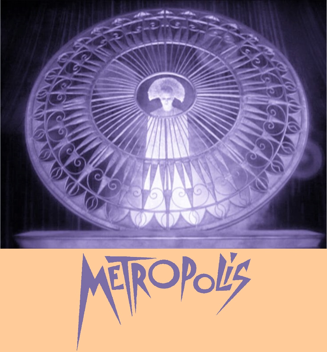 |
Return to previous page |
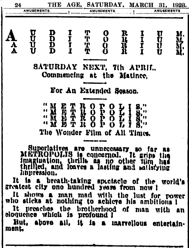
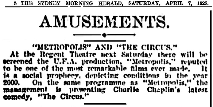
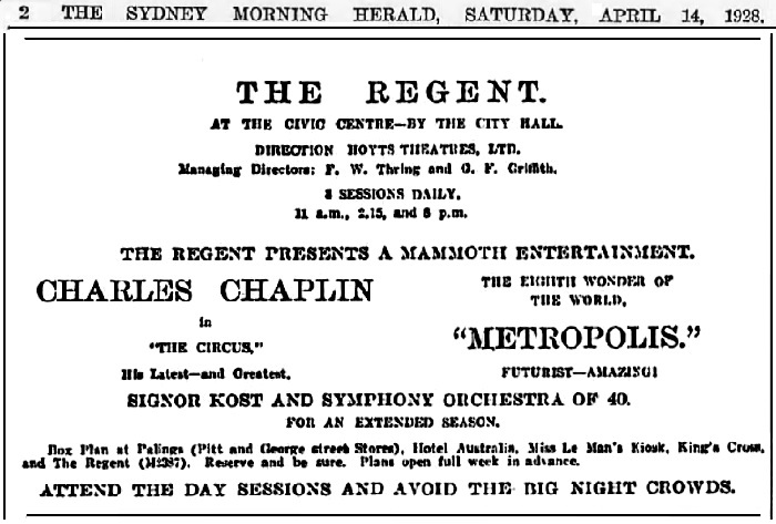
Saturday, 7 April 1928, Australia
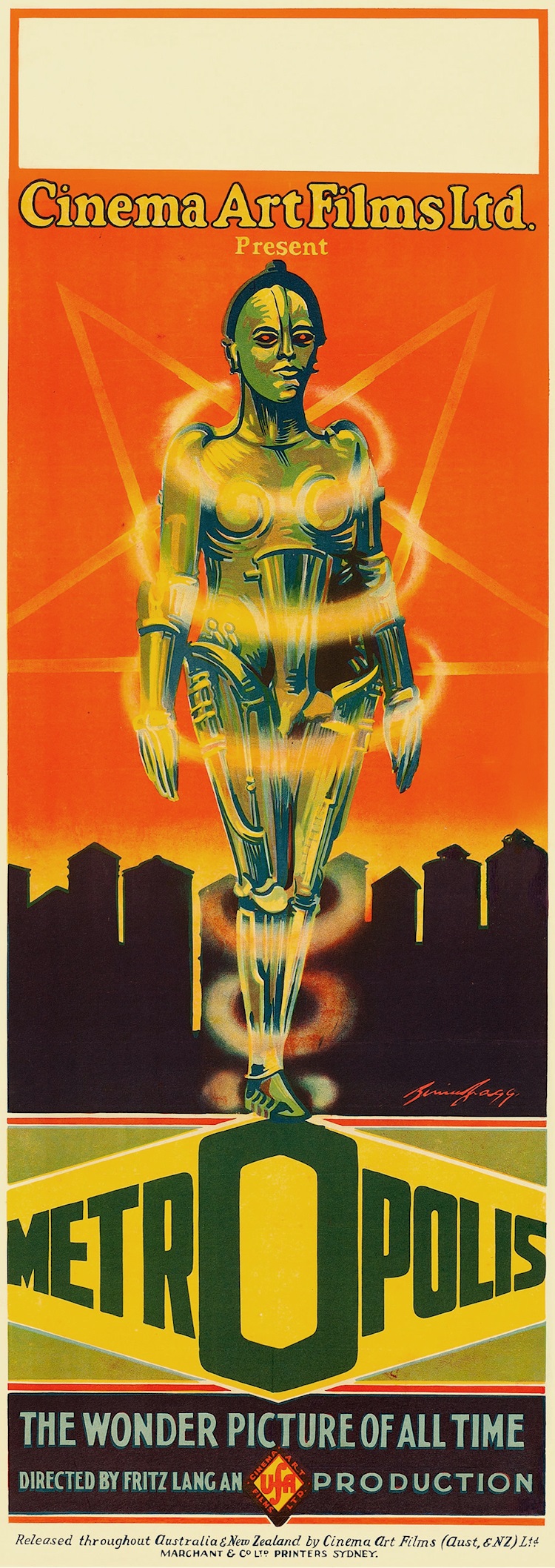
Daybill, 15"×40". Artist: Bernie Bragg.
I stole this image from one of the greatest websites ever invented, “Gods and Foolish Grandeur.”
A good deal of information about the Australian release
can be found on Michael Organ’s defunct website:
“Metropolis Section 8:
Australian Release — 1928.”
This was released by Cinema Art Films, which apparently chopped away at the few prints shipped over from Ufa.
A tinted nitrate original of the Australian edition was discovered in Australia and it still survives.
This print is known as the
Harry Davidson Print.
Who was Harry Davidson?
He was an Australian collector who had once shown
Kenneth Anger his print of Metropolis,
and Kenneth told German film archivist
Enno Patalas of the Munich Filmmuseum
that Harry’s print included material he had never seen before.
Patalas attempted to reach Davidson about acquiring the print, but Davidson did not want to talk.
Ray Edmondson picked up the story in
“Wizards of Oz: Survivals, Losses and Finds in Australian Film History,”
in Roger Smither, This Film Is Dangerous (Brussels: FIAF, 2002):
|
In about 1980, Harry died suddenly, leaving his widow Pat, and his infant daughter Theda.
We were able to purchase his collection of over 2000 reels. Many of its considerable riches —
which included a tinted print of Metropolis and unique copies of some of Harold Lloyd’s
earliest work — have since been distributed to archives across the globe as part of the NFSA
nitrate repatriation program of the 1990s. In every case, the accepting archives undertook to
identify the material in their records as being part of the “Harry Davidson Collection”. This
honoured our original conditions of acquisition and also celebrated Harry’s achievement —
and legacy — as a collector.
|
Here is the Harry Davidson Print.
Click on each image to see the video files on YouTube.
The film is about 9,244' slowed down via frame duplication to 17fps.
It was originally maybe 20' or 30' longer, but there are jumps in the action and reel ends are shattered.
The 17fps speed provides somewhat normal motion in some scenes,
but slow motion in other scenes,
and it is all very stuttery, absolutely not what Fritz Lang wanted.
As mentioned over and over again above, he wanted the film projected at 26fps.
So, when you open these files on YouTube, click on the gear icon, click on Playback speed, and choose 1.5.
That’s very close to the correct speed and it gives the illusion of reducing the stutter.
This has never been available on commercial video anywhere, and so please download it before it vanishes forever.
 tombombadil, Metropolis - original tinted 1928 Australian release version (1/5), 17fps Uploaded on Tuesday, 06 November 2018 |
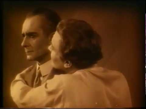 tombombadil, Metropolis - original tinted 1928 Australian release version (2/5), 17fps Uploaded on Tuesday, 06 November 2018 |
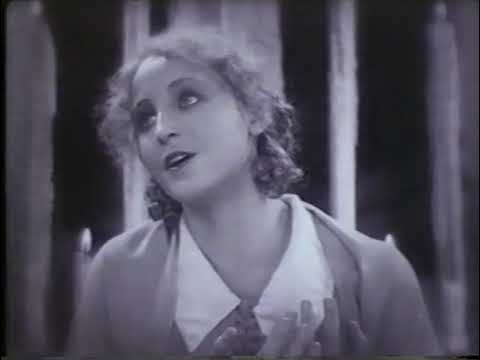 tombombadil, Metropolis - original tinted 1928 Australian release version (3/5), 17fps Uploaded on Tuesday 06 November 2018 |
 tombombadil, Metropolis - original tinted 1928 Australian release version (4/5), 17fps Uploaded on Tuesday, 06 November 2018 |
 tombombadil, Metropolis - original tinted 1928 Australian release version (5/5), 17fps Uploaded on Tuesday, 06 November 2018 |
I combined the files into one:
And here it is again, but speeded up to about 98'/min., just above 26fps,
which is pretty much the way Fritz Lang and Gottfried Huppertz wanted it:
Nice to see the original tints.
I have no idea how the original German prints were tinted.
I don’t think anybody knows.
It could well be that the Australian print followed the German tinting scheme.
Actually, I’m willing to wager that the tinting in this Australian print was identical to the tinting in the original German prints.
Yes, the original German prints were tinted.
I have no documentation to verify that assertion, but it was a feature film, and therefore it was tinted.
It would not have been shown in black and white. Period.
|
I don’t believe the original version was ever tinted.
There are some tinted original prints around,
but they are all different in color depending on where they were found,
and they are all printed from the export neg.
That leads me to believe the film was produced and exported in black and white
and tinted locally whenever a distributor thought it should be tinted.
Even if it would have been tinted,
we have no record of what the tints may have been,
so we left it alone and show it in beautiful black and white.
|
A thought:
Could it have been that Ufa normally tinted its prints,
but that it offered distributors the option of saving money by renting b&w prints?
I have no way of knowing, and perhaps people more knowledgeable than I would have this info at their fingertips,
but I have this nagging suspicion that première prints of feature films were all tinted and/or toned and made with good professional care,
but that later prints intended for shipping out to the nabes and to the boonies were
just quickly and sloppily churned out in b&w, with little or no quality control.
Now I discover something else:
“Lang didn’t like color tints,
and the tints in his films when they were originally released without his approval.”
What is the source of that information?
Does anybody know?
Ah! Never mind. I found it!
From Anke Wilkening’s article, “The Colour Question,” in Journal of Film Preservation nos. 79/80, April 2009,
we learn that, in a letter he wrote to Lotte Eisner on 7 June 1968,
Fritz explained that he had disliked the practice of shooting nighttime scenes
in broad daylight and then tinting those scenes blue.
He preferred cameraman Carl Hoffmann’s method of shooting such scenes in relative darkness.
That’s it.
Fritz did not eschew tinting; he just disliked the artificialty of creating day-for-nights with blue dye.
Well, there you go.
So much for the overinterpretation by modern scholars.
Fritz’s silent films were tinted, all of them, I’m sure.
Rare was the feature film that was not tinted and/or toned.
Rare is an understatement.
Almost unheard of!
I would like someday to check the various tinted editions against one another.
Tinting for the most part followed basic conventions: sepia for day, dark blue for night,
red for fires, and so forth.
Local exchanges would alter that scheme when they ran low on any particular dye.
The print currently owned by David Packard is entirely orange,
which demonstrates that the local exchange just didn’t think the film was worth the bother.
Maybe.
Interestingly, Fritz’s previous epic, Die Nibelungen, was also tinted entirely orange,
and, apparently, that was the intention, and it was authentic.
Maybe that’s what Fritz wanted for Metropolis too?
Maybe. Impossible to say for sure, absent better sources.
Until I can check the surviving examples against one another, I cannot judge what may or may not have happened.
This much I can say, though:
The tinting in the Harry Davidson print looks entirely authentic to me,
and, unless better information is forthcoming,
in my opinion, it would be perfectly acceptable to follow this tinting scheme in the current and future restorations.
Let’s contemplate Packard’s print for a moment.
We can presume that it was a Paramount print, but we cannot be certain,
yet, whatever it was, it had a brief moment missing from all other known prints.
Why?
Where did it come from?
Does anybody know?
I wonder if UCLA has a viewing copy.
I’ll need to ask, won’t I?
You can learn more about the Harry Davidson Print
here,
and you will even see that the 207-page score for this version of the film is (was?) still on file!
All these materials have by now migrated to the George Eastman House, I think.
